To make your webpage noticeable and stand out against the background, you need to decorate it a bit. Modern software tools offer many ways to do this. CSS3 provides nearly unlimited possibilities for the original design of modern websites. CSS3 allows you to quickly and relatively easily make your site unusual and memorable. In this lesson, I will demonstrate how to change the appearance of a select element (dropdown list) using CSS. You can make it non-standard and impressive.
Let’s consider one of the methods for styling dropdown lists.
2. Method of Styling select CSS
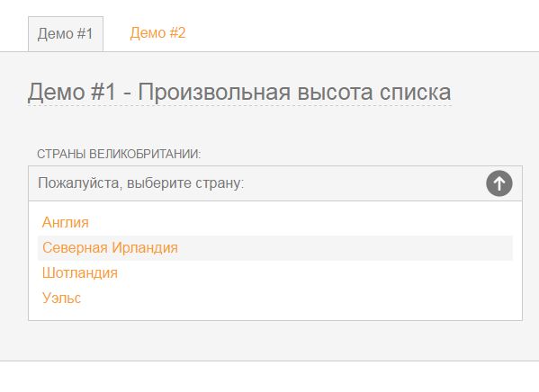
Now I will demonstrate what we can achieve as a result of simple operations:

Here you can download the source code of Select created with CSS:
Let’s take a closer look at the entire process of creating a dropdown list.
Step 1. Connecting Necessary Files
First of all, you need to download the archive with the source materials and take two files from it: style.css and select.js or select_demo2.js. This depends on the type of list you want to create. Include the downloaded files between the <head></head> tags:
|
1 |
<link rel="stylesheet" type="text/css" href="css/style.css" /> <script type='text/javascript' src='js/select.js'></script> |
Step 2. HTML Structure of the Select Element
Everything is very simple and accessible in HTML markup language. A dropdown list with a number of items.
|
1 |
<form action="#"> <p> <label class="label">Countries of the United Kingdom:</label> <select class="turnintodropdown"> <option>Please select a country:</option> <option>England</option> <option>Northern Ireland</option> <option>Scotland</option> <option>Wales</option> </select> </p> </form> |
Step 3. Adding Styles for Select CSS
There aren’t that many styles for select CSS. This material provides styles for the first list. Please remember. There are two paths to the images: one opens (arrow “up”), and the other closes the list (arrow “down”). These paths are also located in the source materials:
|
1 2 3 4 5 6 7 8 9 10 11 12 13 14 15 16 17 18 19 20 21 22 23 24 25 26 27 28 29 30 |
.dropcontainer { position:relative; font-size: 16px; color: #777; } .trigger { color: #777; padding: 10px; font-size: 16px; width: 50%; background: #fff url(../images/select-arrow-open.png) 98% center no-repeat; display: block; border: 1px solid #ccc; -webkit-box-sizing: border-box; -moz-box-sizing: border-box; box-sizing: border-box; -webkit-transition: all 0.5s ease; -moz-transition: all 0.5s ease; -o-transition: all 0.5s ease; transition: all 0.5s ease; } .trigger { color: #777; background: #f5f5f5 url(../images/select-arrow-open.png) 98% center no-repeat; } .activetrigger { color: #777; padding: 10px; font-size: 16px; width: 50%; background: #f5f5f5 url(../images/select-arrow-close.png) 98% center no-repeat; display: block; border: 1px solid #ccc; -webkit-box-sizing: border-box; -moz-box-sizing: border-box; box-sizing: border-box; } .activetrigger { background: #f5f5f5 url(../images/select-arrow-close.png) 98% center no-repeat; color: #777; } .activetrigger { background: #f5f5f5 url(../images/select-arrow-close.png) 98% center no-repeat; color: #777; } .dropcontainer ul { font-size: 16px; border: 1px solid #ccc; border-top: none; background: #fff; list-style-type: none; padding: 10px; margin: 0; width: 50%; z-index: 100; -webkit-box-sizing: border-box; -moz-box-sizing: border-box; box-sizing: border-box; } .dropcontainer ul li { padding: 5px; -webkit-transition: all 0.5s ease; -moz-transition: all 0.5s ease; -o-transition: all 0.5s ease; transition: all 0.5s ease; } .dropcontainer ul li { background: #f5f5f5; outline: none; } .dropcontainer ul li { display: none; } .dropcontainer ul li { border-bottom: none; } .dropdownhidden { display: none; } .dropdownvisible { height: auto; } |
In the demonstration version, all styles are located in the css folder. To display the path to the folder, first specify “..” to go up one level, and then enter the images folder.
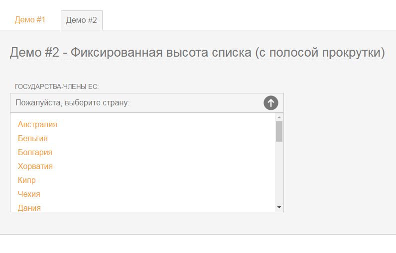
If we want to create a list with a fixed height, there is no need to copy all the styles, it is enough to insert instead of the dropdownvisible style:
|
1 |
.dropdownvisible { height: auto; } |
You also need to modify the scripts according to the instructions provided above. As a result, we get:

In Which Browsers Does This Select CSS (Dropdown List) Work Properly?
- ✓Firefox 24.0, Firefox 25.0, Firefox 26.0
- ✓Chrome 29.0, Chrome 30.0, Chrome 31.0
- ✓Opera 12.14, Opera 12.15, Opera 12.16
- ✓IE 7.0, IE 8.0, IE 9.0, IE 10.0, IE 11.0
- ✓Safari 5.1, Safari 6.0, Safari 6.1, Safari 7.0
- ✓Apple IOS – iPhone 4S, iPhone 5, iPad 2 (5.0), iPad 3 (6.0), iPad Mini
- ✓Android – Sony Experia X10, HTC One X, Kindle Fire 2, Google Nexus
As you can see, with the help of CSS and Javascript, it is very easy to style the Select dropdown list according to your wishes. Success is guaranteed.


Leave a Reply