

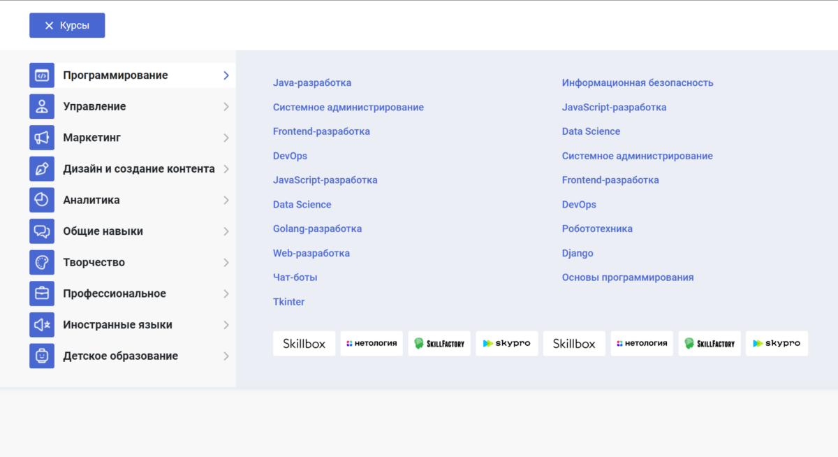
Hello everyone from the author of the Di-grand blog. It’s been a while since I shared some useful tricks for website design. Recently, I worked on an interesting project where I encountered a mega menu for the catalog that expanded upon clicking. This mega menu was not simple because it occupied the entire width and needed to work on mobile devices as well.
Like any professional, I thought I could find a ready-made solution and adapt it. However, it turned out that such menus are scarce. After spending a few hours searching, I decided to create one for myself and share it with all of you. So, here’s the demo for you to check out and download.
And here’s how the menu will look on mobile devices. It’s fully responsive, so you won’t need to use different menus for desktop and mobile anymore. Upon clicking a menu item, you will navigate to the right into the sub-menu, where a back button is available.
If you have any questions about the adaptive, vertical mega menu for the catalog or an online store, feel free to write them in the comments. I’ll be happy to help. Glory to Ukraine!
Leave a Reply