When it comes to creating sliders for a desktop website, CSS is preferred. Compared to similar elements on Javascript, CSS sliders, despite having large images and scripts, load much faster. Today we will look at how to write a slider in CSS.

1. CSS3 image slider
These sliders use radio buttons for navigation, which are usually placed under the image block. Instead of buttons, you can use arrows on either side of the slider for navigation. The order of displayed images is controlled by pseudo-classes…
2. CSS3 image slider with thumbnails
In these sliders, instead of radio buttons, small thumbnail copies of all images are used. This technique is also used to create galleries.
3. Gallery on CSS
Image galleries are popular among web designers of selling websites. These sliders are usually placed at the very beginning so that the potential buyer immediately sees and can evaluate all the advantages offered to them. The slider is also responsive, which is very convenient for users.
4. CSS slider without links
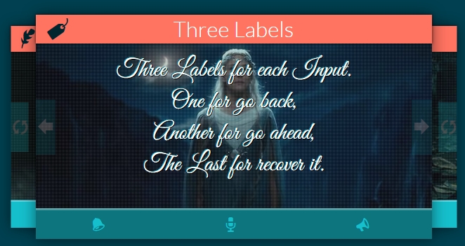
When using such a slider, the screen displays one main image, which is larger in size, and two smaller ones behind it. When the images change, the slides move to the sides, and the one that comes forward becomes the central image, gradually increasing in size and coming to the forefront.

5. Responsive CSS3 slider
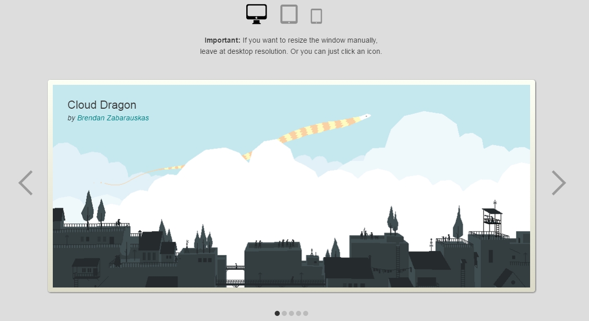
This slider is also controlled using radio buttons. Such a slider can be used on any device: computer, tablet, smartphone.
Conclusion
Today, when users don’t have extra time or the desire to carefully read texts posted on websites, sliders are the best way to quickly and vividly convey information about the offered products, services, and the benefits promised to the customer. Use sliders correctly, and success will not keep you waiting.


Leave a Reply