

Hello. You’ve probably encountered the question more than once — how to design for tablets and phones? There are many methods, such as Bootstrap, fluid design, etc. But there is another method that really caught my attention. Specifically, for each resolution, or a range from – to, you can write your own styles, etc. All you need to do is start writing like this in your style files:
|
1 2 3 |
@media (max-width: 930px) { /* this will be shown at a screen resolution of up to 930 pixels */ here we write our styles } @media (max-width: 930px) and (min-width: 470px) { /* for a screen resolution from 470 to 930 pixels */ here we write our styles } @media (max-width: 469px) { /* if the maximum screen resolution is 469 pixels */ here we write our styles } |
What does this code format do? The essence is that we tell the browser which part of the CSS code should work for a specific phone resolution. For example, if you are using a phone with an HD screen, in portrait mode, the media query from 470 to 640 pixels will most likely be triggered. But if you rotate the phone to landscape mode, the 768px query will be triggered. The beauty is that you can style your site down to the vertical or horizontal orientation of the phone.
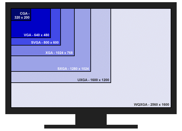
Also, I recommend you familiarize yourself with the different device screen sizes:
- Mobile phones — from 320px. Focus on the iPhone viewport, as it is the smallest. Modern Android phones have larger viewports, so we ignore them (it will stretch in the design).
- Tablets from 768px. Again, focus on the iPad in portrait orientation, as Android tablets usually have viewports starting at 800×1200 or matching the iPad. Tablets with a 600×1024px viewport are outdated. Also, there’s nothing wrong if, in portrait orientation, the site on such a tablet looks like it does on a mobile device, and in landscape orientation — like on a PC.
- PCs and tablets in landscape orientation — 1000px. Why 1000 and not 1024: first, in desktop browsers, the scroll bar usually takes up 18px of width; second, from 1000px, it’s easier for the designer to calculate sizes in percentages, and it will still stretch to 1024px during the design.
That’s pretty much it. If you have any questions, write them in the comments, and we’ll be happy to help you. Thanks for your attention.
Leave a Reply